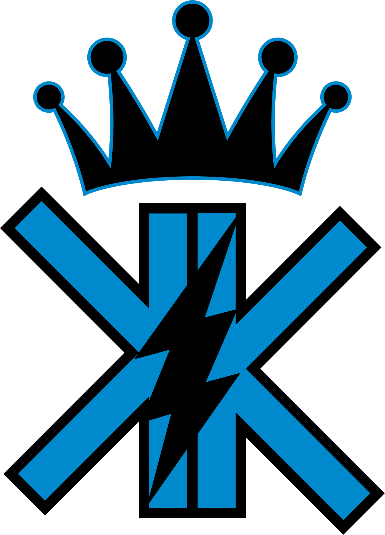
For this logo, the client asked me to create a simple yet recognizable design. To achieve this, I used the two K letters from the name as the focal point, placing them back-to-back in blue. I added a crown above the letters with a blue outline to represent the "King" portion of the name. Finally, I incorporated a lightning bolt, as the client often associates himself with the element of lightning and electricity.